
In order to consolidate our Eye Candy coverage, we’ve developed a new feature: Unwrapped! We’ll take all the new photoshoots from the week and grade (or “brand”) each based on the following criteria:
• Poses (are they versatile or just glorified statues?)
• Uniqueness (have we seen this photoshoot a billion times before?)
Grading scale: Sweet (Great)/Bland (Iffy)/Sour (Awful)
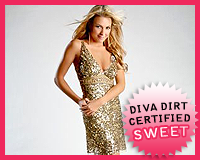 Courtney Taylor‘s Golden Girl
Appearance: A slinky gold dress, covered in sequins, takes center stage in this shoot. The dress looks a lot better further away because up close, the sequins are a bit overkill. Tassel-like earrings, a few rings, and simple heels keep up the metallic theme without making her look like she stepped out of a Bond villian’s lair. Her makeup and hair are flawless and simple.
Poses: Courtney could teach Kelly a thing or two–you can be cute and smiley AND look like you’ve got a functioning brain at the same time. She mixes up her poses and keeps it easy breezy, but not catatonic like her fellow blonde.
Uniqueness: Nothing particularly unique about it, though I haven’t seen a Diva look this natural in photoshoots this quickly.
Grade: Sweet. She knows what works for her, both style-wise and pose-wise. Like I mentioned previously, she’s a natural. So far, she’s 2-for-2 in photoshoots. I like her odds.
• Click to see the rest of the photoshoot.

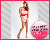 Eve Torres‘s Candy Girl
Appearance: Eve’s wearing a tiny white dress with red pinstripes (Look closely!), accented by a red belt and heels. She, like Brie last week, is content to let the candy color dominate, but she doesn’t douse herself in it like the Bella did. With the bright red lips, she looks delightfully retro, and the flipped hair makes her look like a pin-up. She looks like she jumped out of an old postcard, and I love it.
Poses: In keeping with the pin-up look, Eve does a lot of retro poses–lots of hands on hips and not-so-sexy faces. It’s simple, but works with the theme of this shoot. Anything too adventurous would’ve looked out of place.
Uniqueness: I love retro-styled shoots, and no other Diva has done it lately, other than Alicia from a few weeks back. It’s a break from the norm, and a good one at that.
Grade: Sweet. I could make “Eye Candy”/”Candy Girl”/”Sweet” puns all day long, but I’ll spare you..
• Click to see the rest of the photoshoot.

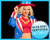 Jillian‘s America the Beautiful
Appearance: This looks like a costume best worn in the beginning of July, but I suppose this shoot was left over from that period and released in commencement of Patriot’s Day. She’s got the over-the-top look down pat–gaudy waistcoat, a matching top hat, and a bright red bowtie. The red lingerie probably isn’t something that Uncle Sam would wear, but she’s got the body for it! Obviously, this is a costume, so it’s not fair to judge it as we do other outfits. In this context it’s cute and fun, and not overtly slutty as I’ve seen it on other women at other times.
Poses: Not much variety here, just a lot of coat-clutching and smiling. I definitely notice her getting away from the “blow-up doll” look, and I’m so glad–she just needs to inject her photoshoots with the kinda of personality she puts in her over-the-top gimmick.
Uniqueness: It’s costume-y, which is unique in itself, but there’s not much else though put behind it. It’s got the intention to be unique, but doesn’t quite get out of the starting block.
Grade: Bland. I’d much rather see Jillian in regular outfits, showing the personality we know she has. Though, I guess at least one Diva has to don the holiday costume, and Jillian drew the short straw.
• Click to see the rest of the photoshoot.

Read more to see the rest of this week’s photoshoots and vote for your favorite.
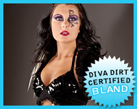 Katie Lea‘s Twisted Sister
Appearance: Is it just me, or has Katie Lea been getting photoshoots more consistently than any other Diva? I guess the more opportunities for her to show off her crazy style, the better. Said crazy style isn’t my cup of tea, as I’ve mentioned countless time before, but in the one she manages to keep it together pretty nicely. The purple in her tights and sash around her waist is echoed in her eye makeup, and is the only color present aside from the black. She clearly has no problem going over-the-top, but knows how to keep it from being an eyesore, sticking to a few colors. She could stand to lose the fur mini-jacket and the Claire’s hair extensions, though..
Poses: More of the usual from her. Her poses kind of make her look like a street performer, which I guess isn’t too far off from what she’s doing these days..
Uniqueness: A Katie Lea photoshoot is unique from the get-go–I think we’ve established that well enough.
Grade: Bland. She’s growing into her gothic persona, but could still stand to lose the extraneous parts. A little fine-tuning would do a world of good.
• Click to see the rest of the photoshoot.

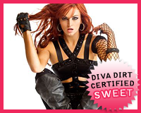 Maria‘s Lip Service
Appearance: Maria’s wearing the top that every Diva this side of Mae Young has worn, but puts her own spin on it, of course. The skin-tight pants, knee-high boots, netting up her arm, and leather gloves are all Maria-like touches, and I must say that she pulls them off pretty well. The fact that it’s all black probably helps–there’s a lot going on, and keeping it in one color prevents it from looking way too overdone. Though at certain angles this looks like a bondage getup, down to the belt buckle that reads “Destroy”. Don’t give ’em the wrong idea, Maria..
Poses: Not one pose is the same, and she’s working it like a pro. It keeps the photoshoot interesting, and she’s certainly not lacking in the creativity department, at times biting the netting on her arm. The fish lips are still present as ever, if minimal.
Uniqueness: I gotta be honest–plenty of Divas look like they just stumbled out a a Bondage-themed club at times, so that’s not exactly a unique point for Maria’s look. The fact that she added all of her signature touches and managed to not take it over-the-top is a relative first for her, though..
Grade: Sweet. Dare I say she wore that top better than the other 27 girls that have worn it? Dare I?
• Click to see the rest of the photoshoot.

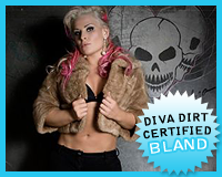 Natalya‘s Calgary Crew (w/ The Hart Dynasty)
Appearance: Natalya’s sporting two looks in this shoot–one is a flowy, flowery top with what looks like Soffee shorts underneath, and the other is a decidedly racier look–black shorts, black bra, and a fur coat. Neither are knocking my socks off. They look like failed attempts at looking edgy, and just don’t flatter her. Don’t get me wrong–it’s nice to see her out of her requisite pink-and-black, but there’s gotta be a better way to escape from the norm.
Poses: She’s posing alongside D.H. Smith and Tyson Kidd, kind of reminiscent of one really old MNM photoshoot–they too posed against concrete walls and chain link fences. This kind of exposes the guys’ lack of charisma–Natalya’s doing the legwork in that department. I do dig the cool photo where Natalya’s being lifted by D.H. Smith, though it kinda looks like an optical illusion.
Uniqueness: It’s an outside-the-arena shoot with her team–that’s pretty unique in my book. If only it were better executed..
Grade: Bland. It’s cool of them to venture outside the confines of an arena and include the guys, but Natalya’s looks just sink the shoot.
• Click to see the rest of the photoshoot.

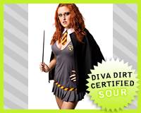 SoCal Val‘s Magical
Appearance: It looks like someone found a slutty Hermoine Granger costume leftover from last year’s Halloween and tossed it at SoCal Val as a last resort, giving her an extra-long chopstick in place of a wand. It’s not sexy, and just looks silly, as that trend probably died before the Harry Potter actors hit puberty.
Poses: Every wizard cliche in the book? Check. Looking like you’ve jumped straight out of a website shilling slutty Halloween costumes? Double check.
Uniqueness: If slapping on a cheap costume was all it took to be unique, then SoCal Val would take the cake. Unfortunately, that’s not the case.
Grade: Sour. Welcome to 2002, Val. Be sure to check out the Winter Olympics in Utah and the 2nd Lord of the Rings movie while you’re here.
• Click to see the rest of the photoshoot.

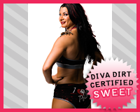 Tara‘s Poison
Appearance: She’s wearing her tights, which are pretty standard for her, save for the words “I <3 Poison" drawn on her butt. It’s cute and kinda of reminiscent of a cheesy tattoo. Let’s just be glad it isn’t actually on her skin. The red highlights in her hair go perfectly with the black-and-red outfit, which has pretty much become her standard color palette.
Poses: Poison’s along for the ride, and I love the photo of the tarantula sitting on her shoulder. It’s almost.. cute? The punching photo is cool, too. Tara certainly has the year-end award for “Best Posing with Living Prop” all locked up.
Uniqueness: Poison is enough to make any photoshoot unique. I’ll tell you what, no Diva is going to pose posing with an arachnid anytime soon.
Grade: Sweet. I love Tara’s enthusiasm, and it’s always a pleasure to see Poison. That is, when he’s not threatening to bit someone..
• Click to see the rest of the photoshoot.

Now that you’ve gotten our perspective, which photoshoot did you like best? Vote in the poll below and sing your song in the comments!
NOTE – If any of you come across any new TNA photoshoots during the week, feel free to drop us a tweet and let us know–it’s tougher to keep track of TNA’s new stuff!
[poll id=”419″]
