In order to consolidate our Eye Candy coverage, we’ve developed a new feature: Unwrapped! We’ll take all the new photoshoots from the week and grade (or “brand”) each based on the following criteria:
• Poses (are they versatile or just glorified statues?)
• Uniqueness (have we seen this photoshoot a billion times before?)
Grading scale: Sweet (Great)/Bland (Iffy)/Sour (Awful)
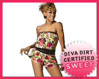
 Alicia Fox‘s Foxy Diva
Appearance: I know a lot of you will hate the outfit, it being a tiny littler romper, but I think it’s adorable and retro. She looks like she’s dressed to hang out at the beach in the late 50s/early 60s. The studded belt kind of takes away from the vintage feel, but it doesn’t ruin the look. Neither do the black heels. I’d love to see a Diva adopt a more retro style–not too costumey, but unique enough to stand out amongst the sea of jean-wearing, halter top-sporting Divas.
Poses: She compliments the outfit by posing in a manner you’d see a 60s catalog model posing–cute, almost innocent. It’s not overtly sexy or suggestive, and I like that it corresponds with the look perfectly.
Uniqueness: The look itself is unique as can be. Not too many Divas are running around in vintage rompers. It’s cute and fun in a way that you don’t see many Divas dressing.
Grade: Sweet. I’m feeling the retro-ness of it all. It’s not going to be everyone’s cup of tea, but I definitely am. Maybe it has something to do with the Mad Men kick I’ve been on..
• Click to see the rest of the photoshoot.

 Courtney Taylor‘s Diva Debut
Appearance: Courtney’s wearing a flowy, one-shoulder dress in a gorgeous purple color. She keeps the rest of the ensemble simple with black wedge heels, a black bracelet, silver earrings and a silver ring. Clearly, she’s only sticking to a simple color scheme. The one dominating color is the purple, and it’s beautiful enough to command the attention and carry the look on its own. The dress itself is loose and not too form-fitting, but still sexy in the way it falls on her frame.
Poses: She excudes a casual attitude through her poses, lying down and half-smiling. She looks comfortable and ready to assume her role as full-fledged Diva. I especially like that she’s not trying too hard, given that this is her first Diva photoshoot.
Uniqueness: Nothing particularly unique about it, as it’s your standard studio shoot. I guess the fact that it’s her first photoshoot makes it noteworthy, though.
Grade: Sweet. She’s just the right mix of cute and sexy. It’s certainly a great first impression.
• Click to see the rest of the photoshoot.
Follow the cut to see the rest of this week’s photoshoots.

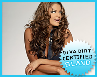
 Eve Torres‘s Sunny Eve
Appearance: Two words: denim vest. The yellow mini=skirt and silver heels are cute and summery in their own way, but I can’t get past that vest. Perhaps she could’ve opted for a blue top.. or a vest that wasn’t made out of denim? Really, anything but that.
Poses: She alternates between poses with a chair and ones alone. It’s all good and well, but her face isn’t doing much alternating itself–she’s making the same expression almost the entire shoot. It’s kind of fascinating, but not the mark of good posing.
Uniqueness: Denim vest?
Grade: Bland. She doesn’t look bad by any means. Just change the top, and this shoot could be going places.
• Click to see the rest of the photoshoot.

 Lilian Garcia‘s Decade Diva
Appearance: Marking her decade of service in the WWE, Lilian’s wearing what I can only assume was a hastily-made custom dress. If it were a plain dress, I’d like it. But, with all the bedazzling and the slogan, it looks a little silly. Maybe if they did it on a t-shirt, it’d look a bit more appropriate.
Poses: As always, Lilian looks fun and spunky, and it’s infectious. The random inclusion of the trunks kind of takes away from it, but I don’t hate it. This look just doesn’t fit with them all that well.
Grade: Bland. The customized dress is the basis of this shoot (hellooo, “Decade Diva?”), and since I’m not feeling it, I’m not feeling the shoot.
• Click to see the rest of the photoshoot.

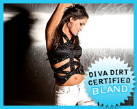
 Nikki Bella‘s Que Bella
Appearance: Nikki’s wearing the top that every Diva is taking turns wearing (clearly you’ve seen us mention it time after time..), and she’s certainly got the figure for it. She’s pairing it with tight white pants that she let a cat attack and come standard black heels. I like that she’s wearing bracelets that call to the different colors and elements in the shoot–dark black, bright white, shiny metals, and even the pyramid studs found on her top. The only weak point is the pants. I think Michelle and Maria found better alternatives.
Uniqueness: Come on, she’s wearing a top that’s basically become the “village bicycle” of Diva clothing items.
Poses: The steel wall is a nice touch, and looks cool with the reflection of the flash bulbs. But what the heck is with the helium tanks? They look out of place and shoe-horned in. It doesn’t help that her poses incorporate them awkwardly. The poses without them look sexy and cool, since she’s not crouching all weirdly.
Grade: Bland. The pants and helium tanks need to be axed, because they’re dragging down what could be a great photoshoot.
Click to see the rest of the photoshoot.

Now that you’ve gotten our perspective, which photoshoot did you like best? Vote in the poll below and sing your song in the comments!
[poll id=”411″]
