Sunday, November 3, 2024

Latest Posts

Unwrapped: Eye Candy for the Week Ending November 7th, 2009

In order to consolidate our Eye Candy coverage, we’ve developed a new feature: Unwrapped! We’ll take all the new photoshoots from the week and grade (or “brand”) each based on the following criteria:

Appearance (hair, clothes, makeup.. you get the drift)
Poses (are they versatile or just glorified statues?)
Uniqueness (have we seen this photoshoot a billion times before?)
Grading scale: Sweet (Great)/Bland (Iffy)/Sour (Awful)

Beth Phoenix‘s Gray Area
Appearance: Tight pants, tight vest, high heels;Beth is dressing sexier than ever. The combination isn’t flawless–it kind of looks piled-on–but Beth works it, and the fact that the shoot is in black and white kind of levels it out. The headband keeps Beth’s signature “head gear” look going without sticking out like a sore thumb. All in all, it’s a flashier look than we’re accustomed to seeing Beth in, but I like it.
Poses: Beth’s complimenting her sexier look with sexier poses, and they look even better in black and white. Maybe the colorless shoot doesn’t work as well in a place as stark as a locker room, but it works beautifully against Beth’s face.
Uniqueness: Like I said, Beth’s looking flashier than she ever has. It sort of looks like she’s carving out a new image for herself, a sexier one. This is definitely a continued step in a new direction.
Grade: Sweet. The outfit could be better, but all in all I like Beth taking new chances.
Click to see the rest of the photoshoot.

Lauren Mayhew‘s New Kid on the Block
Appearance: New announcer Lauren is wearing a pretty brown dress. It’s simple and slim, but the detailing around the bust and the single shoulder strap are gorgeous. The brass heels go with the dress perfectly.
Poses: I’ll give her a pass for being a new Diva, but she kind of looks like she’s posing for a clothing catalog. It’s just kind of boring, and she’s showing shades of Kelly Kelly with her perma-smile. Hopefully she’ll grow beyond the bland posing.
Uniqueness: First photoshoot! She didn’t really make a mark, but introducing yourself is a one-time thing, which kind of makes it unique in itself.
Grade: Bland. The clothing is great, but she just needs to inject some personality in her shoots–she can’t just be another smiley blonde!
Click to see the rest of the photoshoot.

Maria‘s Wild at Heart
Appearance: Some bondage-reminiscent clothing is right up Maria’s alley–it’s black and metal everywhere. Few could pull off this extreme of a look, but I think Maria can. The brass knuckle earrings might be a little too kitsch, though.
Poses: Break out the wind machines! Maria’s hair is flying every which way, and her poses–all arms–compliment that. The wild hair wouldn’t work with every shoot, but it’s already an over-the-top shoot with the outfit, so why not?
Uniqueness: Wild hair, wild clothes.. Sounds like a regular Maria shoot, but it looks surprisingly unique for her.
Grade: Sweet. Get on with your bad self, Maria. Just don’t try to fight anyone with those tiny brass knucks.
Click to see the rest of the photoshoot.

Read more to see the rest of this week’s photoshoots and vote for your favorite.

Melina‘s Precious Metals
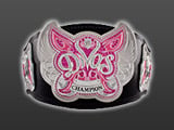
Appearance: Melina’s wearing what might be my favorite tights of hers–the different metal-based shades are gorgeous, and are something you don’t always see in Divas’ ring gears, not to mention it compliments her skin tone perfectly. The Divas Championship is an A+ accessory too, but that’s a given.
Poses: I like the way Melina poses with the Divas Championship is kind of different, with it perched on her shoulder. The rest of the shoot is pretty lax, but there’s a bit of versatility in there. It’s subtle, but it’s there.
Uniqueness: Melina hasn’t done a ring gear shoot in a while, and this would be her second time doing so. It’s not a common occasion for her, so I think it’s pretty cool to see.
Grade: Sweet. The tights are gorgeous, and Melina isn’t that bad herself. It’s the Divas Championship that needs a makeover.
Click to see the rest of the photoshoot.

Tiffany‘s Shaded
Appearance: For some reason, Tiffany’s wearing a Chinese robe and is holding a complimentary umbrella. It’s sexy, but kind of cheesy, like a poster you’d see on a frat boy’s wall. The whole look is too costume-y for my taste, and seems kind of out of the blue. I guess I just feel like it’s walking a thin line when you’re wearing the traditional clothes of another culture–you don’t know who you might offend by “sexy-ing” it up. I’m probably being overly PC, though, so don’t mind me.
Poses: Smiling and twirling an umbrella seems like enough to do in a shoot, but the resulting photos are pretty uneventful.
Uniqueness: It’s different but in a costume-y way, so it’s kind of a “forced” type of uniqueness.
Grade: Bland. Overall, it’s kind of “try hard” to me. You can look sexy without putting together a whole costume.
Click to see the rest of the photoshoot.

Now that you’ve gotten our perspective, which photoshoot did you like best? Vote in the poll below and sing your song in the comments!

NOTE ON TNA PHOTOSHOOTS – I tend to only cover photoshoots with a decent amount of photos. So if TNA has a new shoot with Tara, but there’s only 3 photos, I’m going to skip it. No hard feelings. But if you see any new, sizable TNA shoots feel free to drop us a tweet and let us know–it’s tough to keep track of their new stuff!

[poll id=”439″]

Latest Posts

Don't Miss