In order to consolidate our Eye Candy coverage, we’ve developed a new feature: Unwrapped! We’ll take all the new photoshoots from the week and grade (or “brand”) each based on the following criteria:
• Poses (are they versatile or just glorified statues?)
• Uniqueness (have we seen this photoshoot a billion times before?)
Grading scale: Sweet (Great)/Bland (Iffy)/Sour (Awful)
 Brie & Nikki Bella‘s Sticking to the Pattern
Appearance: Brie and Nikki are wearing matching patterned dresses; Brie is in red, Nikki in gray. I’ve got to say, it’s mile ahead of the directly matching outfits. The girls don’t look as much like they’re in Kindergarten and their mother dressed them identically. It’s a more creative way to embrace their ‘twin’-ness. I can’t say I love their dresses on their own, though–they’re cute, but they wouldn’t look half as interesting on just one Diva instead of two.
Poses: The poses are rather dull, and seem to just be based on them standing next to each other and switching positions slightly. I know there’s only so much you can do with two people in one shoot but this is astoundingly boring, like a cheesy family portrait.
Uniqueness: Brie and Nikki are dressed similarly! What a novel idea!
Grade: Bland. The duo photoshoots are quickly losing their shine. Just let Brie and Nikki do their own things–the results are much more interesting.
• Click to see the rest of the photoshoot.

 Kelly Kelly‘s Enchanting
Appearance: Kelly’s wearing a long blue gown in a pretty aquamarine color. It’s pretty, but looks sort of out of place in a WWE photoshoot. Maybe if the dress was shorter or looked a bit more casual it wouldn’t look like Kelly was about to go to a ball or compete in a Miss America competition.
Poses: It’s your standard Kelly Kelly photoshoot, with not much going on around the face. She uses her arms and the rest of her body to make this a bit more interesting, but her posing still bears shades of a mannequin. The floor-length dress doesn’t do much to dispel that illusion.
Uniqueness: A Diva wearing a floor-length dress is something of an anomaly around these parts, I must say.
Grade: Bland. Kelly never seems to put much effort into making her photoshoots interesting. I don’t know why.. Maybe she’s just letting her looks do the talking.
• Click to see the rest of the photoshoot.

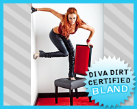
 Maria‘s En Fuego
Appearance: It’s Maria, so we know a few things are for certain: there will be bright colors, bold prints, and a single glove. Check, check, and check. I can’t say a red leopard print vest is my cup of tea, but it certainly fits her style. The shiny black pants and silver heels keep the wild theme running, but somehow keep it grounded a bit with their neutral tones.
Poses: This is where the shoot goes off the tracks. I understand and appreciate the attempts to excite and surprise the viewer, but posing with a random fire extinguisher just looks odd, and balancing on a chair and the wall don’t look surreal in a Salvador Dali sort of way–it just looks kind of weird. To be fair, I’m always telling Divas to mix it up and makes things exciting, but I think this is taking that a bit too far and into the deep end. I don’t think the objective of a WWE shoot should be to get people gawking, like you’re modeling in a high fashion magazine or something.
Uniqueness: Well, it’s definitely unique. I’m sure that was the intent of this mess.
Grade: Bland. I appreciate her gumption, I really do. It’s just.. not unique in a good way–more of a head-scratching way.
• Click to see the rest of the photoshoot.
Read more to see the rest of this week’s photoshoots and vote for your favorite.

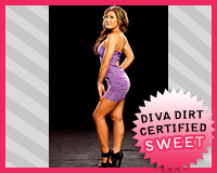
 Savnnah‘s Purple Passion
Appearance: A tight sexy purple dress hows off Savannah’s curves in all the right places. It’s gorgeous, and her shoes give it even more of a fashionable feel. The cutouts in the back are sexy as well, but still provide a bit of mystery.
Poses: She doesn’t exactly break barriers with her poses, but she compliments the shape of the dress perfectly. She looks statuesque. She could always stand to do a little more in this department, but here, it looks good enough. I’m sure moving too much in that dress could cause problems anyways..
Uniqueness: It’s a sexy dress–not groundbreaking, but great nevertheless.
Grade: Sweet. Sexy, cute, and not trying too hard. Looks like a home run for me!
• Click to see the rest of the photoshoot.

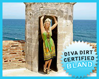
 Tiffany‘s The Tourist
Appearance: In keeping with the sunny San Juan locale, Tiffany’s wearing a bright, festive printed dress. The greens, yellows, and oranges are quite pretty, but the dress looks a little too casual for the shoes–those aren’t sight-seeing shoes, Tiffany! The looks just isn’t cohesive.
Poses: Tiffany plays second fiddle to the scenery, and rightfully so–it’s gorgeous! These shoots aren’t really meant to showcase the girl, so it’s not like Tiffnay needed to be busting out crazy poses or something.. It kind of makes it feel like we’re exploring along with her, which makes for interesting vacation photos, but kind of a “blah” photoshoot.
Uniqueness: I love the unique locations the Divas have been putting out lately, and Tiffany’s adding to this budding trend.
Grade: Bland. Tiffany looks like she’s a regular tourist, which is fine and good, but this is a photoshoot! Vamp it up a little!
• Click to see the rest of the photoshoot.

Now that you’ve gotten our perspective, which photoshoot did you like best? Vote in the poll below and sing your song in the comments!
NOTE ON TNA PHOTOSHOOTS – I tend to only cover photoshoots with a decent amount of photos. So if TNA has a new shoot with Tara, but there’s only 3 photos, I’m going to skip it. No hard feelings. But if you see any new, sizable TNA shoots feel free to drop us a tweet and let us know–it’s tough to keep track of their new stuff!
[poll id=”433″]
