In order to consolidate our Eye Candy coverage, we’ve developed a new feature: Unwrapped! We’ll take all the new photoshoots from the week and grade (or “brand”) each based on the following criteria:
• Poses (are they versatile or just glorified statues?)
• Uniqueness (have we seen this photoshoot a billion times before?)
Grading scale: Sweet (Great)/Bland (Iffy)/Sour (Awful)
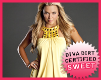
 Courtney Taylor‘s Taylor Made
Appearance: Courtney’s got on a super-short yellow dress with a bubble hem. It’s nice that it’s loose, because it balances out the shortness of it. The accented collar adds an extra pop, and I love the differing shades of yellow.
Poses: The poses here are a lot less adventurous than the ones her her previous shoots, but she still works the camera. She just needs to not fall into a “statue-posing” rut.
Uniqueness: The dress is in a gorgeous shade of yellow. For some reason, you don’t see yellow too often on Divas.
Grade: Sweet. The itsy-bitsy, teeny-weeny, yellow dress is cute–but not too simple–and Courtney herself just look fabulous.
• Click to see the rest of the photoshoot.

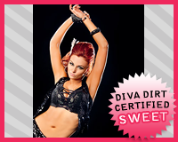
 Daffney‘s Tough as Nails
Appearance: It’s all leather and denim here, with Daffney sporting a leather corset and collar with a pair of jeans. But what really catches your eye (*cough*) is her extreme eye makeup. It’s not really spooky like Katie Lea‘s, but more so tough. I don’t want to say it makes her look like she’s got two black eyes, but I can’t help but think so. Maybe that just adds to her “extreme” persona, like she just got into a knock-down, drag-out fight with some girl that looked at her funny.
Poses: The glaring and baring teeth is fitting for her look without looking over-the-top or silly. She also looks surprisingly sexy in a few. All that considered, I’m guessing she did her job right.
Uniqueness: I think it’s safe to say that this style shoot isn’t uncharted territory for her.
Grade: Sweet. She pulls it off so well while distancing herself from other “gothic girls” like Katie Lea. She’s showing that this persona isn’t at two-dimensional as you might think.
• Click to see the rest of the photoshoot.

 Katie Lea‘s Witchcraft
Appearance: Speaking of gothic girls, Katie Lea’s wearing what’s now become her trademark–black, black, and more black. Her eye makeup is getting more complex. And is it just me, or does that red scarf dangling down almost look like a huge trail of blood?
Poses: It’s the usual Katie Lea fare, but the cool foreshortening done in some of the shots looks a bit strange and unsettling, but definitely fits with the mood of the shoot. It’s like it’s mimicking her ~warped~ mind.
Uniqueness: Nothing new for Katie Lea (by a long shot), but I love the camera angles and different perspectives used in the shoot. Though I’m not sure it would fit with most other Divas.
Grade: Bland. It’s all cool as hell, but I can’t help but think she’s holding back on us a bit. I know there’s more to her than doing this type of shoot over and over and over…
• Click to see the rest of the photoshoot.

 Madison Rayne‘s Back in the Groove
Appearance: Madison’s back in her Beautiful People style which, judging by her one non-TBP shoot, isn’t exactly a tragedy. This outfit’s still pretty fugly, but at least she has the excuse of the trashy style the team’s become known for. Here, she’s displaying the style in spades, wearing a bra, tiny skirt, and a shade of hot pink. This is far from the trashiest the Beautiful People have looked, but it’s still not all that great. Though, I guess you can’t expect them to suddenly class it up–it’s just not in their style.
Poses: She looks surprisingly sweet.. Are we sure she’s fit to be in The Beautiful People? Aside from her apparent lapse in attitude, the poses are decent. They’re sexy without being too hoochy. Wait, there’s another non-TBP-esque trait. Hm..
Uniqueness: She’s a ready-made Velvet Sky clone. Nothing unique here..
Grade: Bland. Let’s face it: The Beautiful People aren’t ever going to win any style awards. If you judge this shoot while keeping that in mind, it’s not all that bad.
• Click to see the rest of the photoshoot.
Read more to see the rest of this week’s photoshoots and vote for your favorite.

 Maria‘s Feather in your Cap
Appearance: It’s classic Maria style, with layer upon layer of dark shiny stuff. I like that she keeps it relatively simple with the single color. A Carrie Bradshaw-esque touch–a feather in her hair–doesn’t look as out of place as it should. This looks fits Maria’s rock-n-roll, pile-it-all-on style perfectly, and in a good way.
Poses: the fish lips are still out to play, but not in full-force, so I’m grateful for that. The poses are pretty interesting and not too typical, but she probably spent too much time showing off her necklace.
Uniqueness: Is a well put-together Maria a unique sight? I guess that depends on your specific stance..
Grade: Sweet. She wears her style in a way that flatters. I hope she keeps it more like this in the future, but that’d probably be too safe of a move for her..
• Click to see the rest of the photoshoot.

 Tara‘s Strapped In
Appearance: A strappy bodysuit would probably look skanky on anybody else, but Tara has such a killer body that she looks more like an amazonian warrior than a stripper. Godo thing she’s got another layer on under, because it looks a bit ill-fitting. The silver accents add a bit girly touch–something you don’t see from her too often.
Poses: A random pose in a chair kind of looks out of place in TNA’s mini-sized shoots, but the screaming pose is killer. The rest are almost too sultry from what we’re used to seeing from her, if that makes any sense. Not that she doesn’t pull it off, because she totally does..
Uniqueness: Tara looks like a badass, but that’s nothing new. Maybe, looking at it from that angle, she wouldn’t really want to be unique. Hm..
Grade: Bland. Nobody pulls off the hot-tough vibe like Tara. The poses could definitely be better, though..
• Click to see the rest of the photoshoot.

 Tiffany‘s Island Girl
Appearance: What else would a diva wear on a beach other than a bikini? This particular bikini isn’t exactly my cup of tea–the black lace and ribbons kind of make it look like lingerie–but she looks pretty damn good in white. The gold heels look kinda out of place, I have to say.. I guess they’re too fancy for such a lax environment.
Poses: The best are when she’s simply lounging in a hammock, as she looks effortlessly sexy. The others veer into the “try-hard” territory, especially when she’s posing with the shower heads, but I gotta give her points for experimenting and not just being satisfied with letting the bikini do the talking.
Uniqueness: I guess she was the only Diva invited to the beach trip, so she’s unique in that aspect.
Grade: Sweet. The bikini may not be my favorite, but I like that she put some effort in her posing. It just shows that she thinks through her shoots and doesn’t rely on her figure to sell it. I can’t say the same for some others..
• Click to see the rest of the photoshoot.

Now that you’ve gotten our perspective, which photoshoot did you like best? Vote in the poll below and sing your song in the comments!
NOTE – If any of you come across any new TNA photoshoots during the week, feel free to drop us a tweet and let us know–it’s tougher to keep track of TNA’s new stuff!
[poll id=”424″]
