
In order to consolidate our Eye Candy coverage, we’ve developed a new feature: Unwrapped! We’ll take all the new photoshoots from the week and grade (or “brand”) each based on the following criteria:
• Poses (are they versatile or just glorified statues?)
• Uniqueness (have we seen this photoshoot a billion times before?)
Grading scale: Sweet (Great)/Bland (Iffy)/Sour (Awful)
 Brie Bella‘s Red Hot
Appearance: Both of the Bellas seem partial to the color red, as more often than not, they wearing red tights or are sporting red flowers in their hair. I can’t say it’s a bad thing, though–they look terrific in red. Their bright red ring attire may not be my favorite, but Brie’s dress in this photoshoot is absolutely gorgeous. It’s cute and sexy, but looks like something even your average girl could wear, unlike some of the more “ambitious” Diva outfits. The gigantic flower looks like it may give her a neck ache, so a downsize in that department wouldn’t hurt. The shoes are red as well, and have little rosettes on them. This hyper-coordination brings it just a hair away from overkill–black shoes would’ve kept the look from being too matchy-matchy. Though, as is, Brie still rocks it.
Poses: Sweet grins and knowing smiles are her obviously strong suit–she pulls them off without looking too try-hard or air headed. She’s a prime example that a Diva can look drop dead sexy without sticking out her butt or making fish lips all day long.
Uniqueness: Just your standard studio shoot..
Grade: Sweet. Red is her color, and though the look could use a bit of a reduction on that hue, she looks great. She looks very at ease in the photoshoot, and shows that even though the WWE seems keen on packaging the Bellas in a one-size-fits-all way, she’s got a spark of her very own.
• Click to see the rest of the photoshoot.

 Christy Hemme‘s Untitled
Appearance: Sticking to the familiar ring attire she’s worn since the WWE, Christy’s wearing a teeny weeny bikini top and matching skirt. The color is gorgeous, and the ribbed fabric adds a little bit more substance to it. Her red hair compliments the color of the outfit really well–it just pulls the whole thing together, as simple as it all is.
Poses: TNA’s photoshoots are notoriously small, so a Knockout only has a few photos to show some variety. Christy does this pretty well, showcasing both her sex appeal and the spunkiness that she was so associated with in her time with the WWE. It’s all toned down compared to her more in-your-face shoots.
Uniqueness: Well, Christy is rarely this toned-down and mellow, so I suppose that gives this shoot a unique edge.
Grade: Sweet. With that beautiful greenish-blue outfit, how could I rate it any differently?
• Click to see the rest of the photoshoot.
Follow the cut to see the rest of this week’s photoshoots.

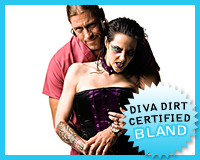 Daffney‘s Untitled (w/ Dr. Stevie)
Appearance: I’m not of the gothic taste, so the purple and black combo isn’t working for me. I know that it’s all in keeping with ther character, but that doesn’t make the corset and skirt any prettier. The matching spiked collar is probably best left at Hot Topic with the Twilight-themed perfume. Her makeup is extreme and it looks like she’s got two shiners, but it goes with the rest of the look perfectly, so I can’t really hate it all that much.
Poses: She’s got the vampire chick attitude down, baring her teeth and glaring at the camera like a girl with a vendetta. Dr. Stevie looks reallllly out of place, but that’s probably the point.
Uniqueness: Photoshoot-wise, you don’t see a goth chick paired up with a dude in an embroidered therapist’s shirt all too often..
Grade: Bland. I can’t help but think Daffney could pull off her crazy and demented look with a little more flair instead of heading into that cliche purple-and-black hued, spikes-and-fishnets goth territory.
• Click to see the rest of the photoshoot.

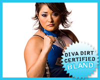 Hamada‘s Untitled
Appearance: She’s wearing her ring attire, which while common in Japanese wrestling, is pretty unique Stateside. There’s no much to say about it other than the fact that I love that shade of blue. I’ve gotta say that it’s sort of refreshing to see more reserved ring gear.
Poses: Hamada is clearly not in TNA to do cheesecake photoshoots or anything of that sort, so she’s not going to be posing like most of the Knockouts do. The more serious wrestler poses with the clenched fists are more up her alley, I’m guessing, and are pretty typical with the badass female wrestlers in Japan. Though, it wouldn’t hurt to see a little more fire in her eyes.
Grade: Bland. I’m not gonna be harsh on Hamada because she’s far from your typical big-boobed and tummy-baring Knockout or Diva–photoshoots aren’t her bag. All in all it’s a tiny and unremarkable shoot, but it’s still cool to get our first taste of her, however small.
• Click to see the rest of the photoshoot.

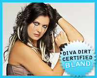 Katie Lea‘s Bewitched
Appearance: Going all-out with her dark persona, Katie Lea’s got on a corset, leather pants, and knee-high boots, all in varying shades of black. Those are well and good on their own, but her extensions stick out like sore thumbs (though that’s probably intentional) and her makeup rivals Daffney’s for sheer gusto. It’s nothing that’ll land her on the cover of a fashion magazine, but I admire her tenacity.
Uniqueness: Show me another Diva that’s wearing tear-stained eyeliner. Go ahead, find one..
Poses: It’s your typical Katie Lea poses–lots of hand usage and glares–but she tones it down a bit, making for some more Diva-like poses. Now, I’m not telling her to conform, but it’s nice to see her keep it in check a little and not take it over-the-top for the entire shoot.
Grade: Bland. The look could be better, especially the hair. Is there a creature trying to escape from her head or something? But overall, I like her uniqueness. It’s not going to win her 5 stars every time, though..
Click to see the rest of the photoshoot.

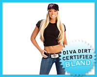 Kelly Kelly‘s Divas on Top
Appearance: This is one of those rare ultra-casual looks, with her wearing a simple black tee (though regular girls would probably cover their stomach) and jeans. Up top is a Divas brand baseball cap which gives me shades of the Divas Championship, and that ain’t a good thing. Aside from the hat, I like the look and its simplicity.
Uniqueness: T-shirt and jeans usually aren’t the makings of a Diva shoot, but I like it when the girls go to more casual route for a change.
Poses: It’s like they took one expression and pasted it on all the photos–there’s literally no change in her face. I know I used to rag on Kelly for being like a “statue” in photoshoots, but I thought she progressed from that. It looks like being confined in jeans made her less adventurous. The perma-smile kinda makes her look like a soulless fembot..
Grade: Bland. This is statue Kelly at her worst, pose-wise. The look itself is just fine, but you might as well take one photo and reload the page 8 times, because it’s all the same. Though, I wonder if she could wear that baseball cap when she’s shielding her face from Piven-stalking paparazzi.. It’d help give a bit more press to Divas division–I’m just saying!
Click to see the rest of the photoshoot.

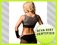 Madison Rayne‘s Untitled
Appearance: Is this her new, non-Beautiful People ring attire? If so, I think she’s gone too far in the opposite direction of the hot pink theme.. The black netting and nude lining just aren’t doing her any favors. It’s frankly kind of “blah” compared to her usual sorority-sister-on-crack look. At least that was interesting in its awfulness.
Uniqueness: I really wish I could say netted pants were unique in women’s wrestling..
Poses: This is more about showcasing the outfit than the girl, so the posing’s rather plain. She’s got a pretty smile, though, and frankly I’d rather look at that than this outfit..
Grade: Sour. Yucky tights, yucky photoshoot. When TNA usually provides 5 photos max in a photoshoot, it kind of puts the pressure on the look. If it sucks chances are the shoot’s gonna suck, and this shoot has only 4 photos, so it’s not lookin’ good..
Click to see the rest of the photoshoot.

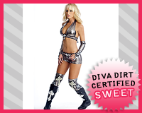 Michelle McCool‘s Silver Fox
Appearance: Wearing her silver ring gear, Michelle shows that she’s definitely got a signature in-ring look. I always love when girls develop their own unique gear style–it helps set them apart. The silver looks great on her, though there’s enough crosses on there for her to start a seance on-point. It fits her personal attitude well–she’s a church-going girl, after all–but for an arrogant heel, I’m kind of shocked to see so much religious symbolism. That’s not to a say a baddie can’t be religious, of course, it’s just the concept of sinning. Heels definitely do more than their fair share of sinning–cheating, lying, insulting others–so she probably just spends overtime in the confessional.
Uniqueness: The attire is unmistakeably Michelle, that’s for sure.
Poses: She gives us a good look at her ring gear, doing a 180. She also shows a good heel edge in her facial expressions. She expresses arrogance pretty well, and I kind of feel like she’s glaring directly at me.. eep.
Grade: Sweet. I almost always find ring attire photoshoots interesting–I just like getting a better look at the gear. It doesn’t hurt that Michelle’s channeling her in-ring persona quite well while showing off her duds.
Click to see the rest of the photoshoot.

 ODB‘s Untitled (w/ Cody Deaner)
Appearance: She’s not looking to turn heads with her outfit, obviously, so the black tank top and camo shorts aren’t much to look at. I kinda dig the belt buckle, though..
Uniqueness: I’ll wait until the “posing” category to blow a gasket, but that particular aspect makes it unique, I guess..
Poses: It’s pretty much her posing with her new Knockouts Championship (and grabbing her boobs), but Cody Deaner pops up for a stupidly cheesy “tug-o-war” pose. Soo.. are they really going to be fighting over this? Are we going to see skit after skit of this? If these photos are any indication, it’ll play out like a dim-witted Tom & Jerry cartoon. Puke puke puke..
Grade: Sour. Not gonna lie, Cody Deaner destroyed any chance of this photoshoot not being sour.
Click to see the rest of the photoshoot.

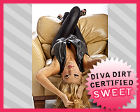 Rosa Mendes‘s Love at First Sight
Appearance: Leather, leather, and more leather. Rosa looks like a badass biker in a leather vest, leather pants, and black shoes. Her silver accessories kinda keep it from going gothic, and her winged eyeliner makes the look that much more edgy. The shoes would probably look funkier outside of an all-black ensemble, but they don’t look that bad here. And I’m not an expert on weaves, but it doesn’t look like her hair’s changed all that much for the better..
Uniqueness: Leather’s not all too foreign in Diva shoots, but pulling it off so well is.
Poses: She’s going all-out, posing every which way on a comfy leather chair. She’s got a sexy-bitchy vibe going, which she’s kinda grown into in her photoshoots. I gotta admire a girl using her prop for all it’s worth, even to the point of hanging upside down. Careful with your hair, girl..
Grade: Sweet. The poses are great, and the look is edgy and sexy in a way that she pulls off well. I guess she’s graduated from the bright colors and ruffles, eh?
Click to see the rest of the photoshoot.

Now that you’ve gotten our perspective, which photoshoot did you like best? Vote in the poll below and sing your song in the comments!
NOTE – If any of you come across any new TNA photoshoots during the week, feel free to drop us a tweet and let us know–it’s tougher to keep track of TNA’s new stuff!
[poll id=”414″]
