In order to consolidate our Eye Candy coverage, we’ve developed a brand new feature: Unwrapped! We’ll take all the new photoshoots from the week and grade (or “brand”) each based on the following criteria:
• Poses (are they versatile or just glorified statues?)
• Uniqueness (have we seen this photoshoot a billion times before?)
Grading scale: Sweet (Great)/Bland (Iffy)/Sour (Awful)
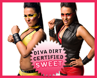
 Alissa Flash‘s Untitled
Appearance: She’s wearing tow different color variations of her ring gear, with eye paint to match. I gotta say that I love the warrior paint, as it definitely gives her an edge. It’d look silly on other girls, but Alissa’s enough of a badass to pull it off. That, and you don’t see anything but eye shadow or mascara on most female wrestlers’ eyes–it sets her apart, and in a good way. The outfit itself is pretty much your stard ring gear: shorts and a belly-baring top. The leather collar and cuffs spice it up a bit, and add to her hardened look. Leather and grommets on a lot of Divas look silly and forced, but I don’t get that from Alissa. Maybe it’s because she isn’t trout-pouting me to death. She looks like a true badass.
Poses: For the meager amount of photos she had, Alissa mixed it up pretty well. The fists and finger point gratefully stay out of the much-treaded “porn poses” territory and keeps with her character. Her evil half-grin is enough to send chills down your spine, no?
Uniqueness: It’s certainly nothing you’d see out of a Diva, huh? From the face paint to the serious poses, it’s almost everything the Divas are not. She’s not sexing it up for the sake of a photoshoot, and for that I’m grateful. It’s always a shame to see a Diva depart from her character to show some epic cleavage or do a cheesy pose. Alissa isn’t blending in with this one, that’s for sure.
Grade: Sweet. It’s a tiny, tiny photoshoot, but I really like it. Everything’s in keeping with her character, and she’s experimenting with her look enough to make it interesting, but it’s not like we’re not staring at gigantic feathered hairpieces or something equally as awful.
• Click to see the rest of the photoshoot.
Follow the cut to see the rest of this week’s photoshoots.

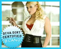
 Beth Phoenix‘s Glamour Girl
Appearance: This is something very un-Beth-like, and that’s not always a bad thing, but in this case it is. The “sexy secretary” look can look cheap and cheesy if you’re not careful, and Beth isn’t careful with this one–her red bra is peeking through, for Christ’s sake! It doesn’t look sexy, unless you’re in the pages of FHM or something. All of it kinda of looks like one piece–a cheap alternative to actually putting together an outfit. Don’t get me wrong, she looks fantastic in more form-fitting clothes, but I’d prefer that they made her look sexy instead of just slutty.
Poses: In keeping with the more feminine look, her poses are more tame than her usual balled fists and glares. She certainly looks innocent and sweet, and that would be all fine and good if her bra waving waving hello at us. Not buying it, Beth.
Uniqueness: Well, it’s not a typical Beth look, that’s for sure. But as far as Diva photoshoots go, showing this kind of skin is par for the course. Is it truly unique if you’re changing yourself into something everyone else already is? I’m not quite so sure..
Grade: Bland. I don’t hate it, but on first glance I let out an audible “ugh”, which pretty much says that I’m not going to be too fond of it. She doesn’t look like a train wreck or anything, but it’s all pretty cheesy and seems put-on. It certainly could be worse, though.
• Click to see the rest of the photoshoot.

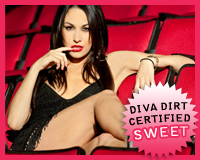
 Brie Bella‘s Ciao Bella
Appearance: The first thing I noticed was that her lipstick matched the seats. I’m sure it wasn’t intentional, but it helps make the ensemble look much more simple than it would otherwise–there’s only two colors competing for attention in the photoshoot, so despite the fact that she’s wearing really bold lipstick, it doesn’t look clownish. The dress is knitted, so it’s just see-through enough to be sexy and not skanky. It’s not your typical “little black dress”, but it’s still cute and casual, so I dig it. Her hair is sleek and, paired with everything else, makes her look like quite the temptress.
Poses: She’s lounging in the seats, so it’s not exactly glamorous, but she gets points for a unique concept. Seeing her relaxing in the sea of red is effortlessly sexy, and she does just about as much as she can with them–laying down, sitting back, crouching. Though I wouldn’t advise laying on those, Brie–you don’t know what or who’s been there. :P
Uniqueness: Like I said, the concept’s cool and new. And it doesn’t clash too much with her look, so it doesn’t look forced upon. The setting alone makes it unique in my book.
Grade: Sweet. I just like that they’re thinking a bit outside the box with this one. Brie looks great, and at ease. She doesn’t seem to try too hard, and I like that about both her and her sister.
• Click to see the rest of the photoshoot.

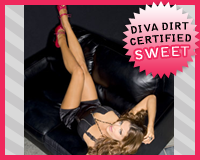
 Eve Torres‘s Back in Black
Appearance: Eve’s nearly busting out of her black dress, which I’m sure was intentional, as there’s a zipper there. It’s not exactly the most subtle look, but it sure is sexy. Her wild hair adds to this rough-but-sexy look, and her pink heels break up what otherwise could be a more dull ensemble. The pink pops, and kind of draw the focus away from her zippered chest, which is a plus in my book. Now, the fact that it’s attracting the foot fetishers is another matter.. She looks like a sexpot, but one that could kick your ass too. I’m intrigued.
Poses: She’s lounging around on a leather chair, and the texture goes with the tough dress–dark and shiny. It gives the photoshoot a bit of an edge, and with her laying on it every which way, it allows her to comes up with a variety of poses. I can’t say her expression matches the mood of the shoot too much, it’s almost too detached from the surroundings. Maybe a more serious attitude was needed.
Uniqueness: It’s cold and dark, something that’s not new to Diva photoshoots, but also something you don’t see every day. I like photoshoots that have more of an edge, and this one has it. The stripped-down scenery helps maintain that sense of mystery. And let’s face it, with the Divas, there’s not much mystery involved.
Grade: Sweet. Clearly, her goal here was to look like a bombshell. Mission accomplished.
• Click to see the rest of the photoshoot.

 Maria‘s Play Nice
Appearance: Maria’s wearing her referee gear (full-time career change, perhaps?), and it of course has “Maria” written all over it–the trademark stripes transformed into a one-piece, the gloves, and (most of all) the ridiculously frigned bootcovers. She almost looks like a Clydesdale moonlighting as a referee. But still, that’s typical Maria, so we shouldn’t be too aghast. Everything aside from the fringe actually looks pretty cute. It’s pretty clear by now that Maria likes to put her own spin on things, and as far as those instances go, this one isn’t all that bad. Still, I wonder what the real, tenured referees think about a girl running around in their stripes looking like that. They’re probably too busy staring anyways..
Poses: Obligatory Maria photoshoot check: Fish lips? Check. Okay, got that out of the way. She looks pretty lively in her gear, and it brings an element of fun to the shoot. She’d probably look ridiculous with a stone cold expression while in that gear, so I suppose “fun” is the way to go.
Uniqueness: Well, her look is unique. It almost reminds me of those cliched photo shoots where the Divas wear sports gear, but this has a bit more of a purpose–Maria is sort of a referee, after all. Other than that, it’s just your standard studio shoot.
Grade: Bland. I don’t really catch the vibe of a competent referee in this shoot. But I guess that’s not what they were going for when they made a Diva a temp referee. The look isn’t the best, but you can’t expect simplicity or even subtlety with Maria. You take what you can get, and this one isn’t all too terrible. That sounds pretty mean, but I’m never too big on her photoshoots, and I can actually appreciate this one for what it is, which is a rarity.
Click to see the rest of the photoshoot.

 Nikki Bella‘s Bella in Blue
Appearance: Now, I know I said that thing earlier about the Bellas “not trying too hard”, but this photoshoot pretty much negates that statement. I mean, what in the hell is she wearing? I’m not qutie sure what to call the top she’s wearing, but at least it’s in a pretty shade of blue. Under it, she’s wearing a pair of jeans that look nice, but don’t really go with monstrosity on top. But to be fair, nothing would. She’s wearing a hippie headband on her head which too is cute, but doesn’t make much sense in this ensemble. The whole look is a bit of a mishmash, with nothing quite going together as it should. I guess someone was a bit overzealous in the planning stages of this shoot.
Poses: If you couldn’t tell with the headband, her poses tell you that she’s going for a “peaceful” vibe, with most of the poses featuring some random clasped-hands pose that just looks silly and out of place with what she’s wearing. It’s all a bit too contrived for my liking.
Uniqueness: The look is different, but I’m not sure too many Divas aspire to the “I fell into a dark closet” look. I can’t tell if she’s going for a hippie or a clubbing vibe. If I were to guess, with the surplus of “peaceful” poses, she’s going with the former, and the feathers hanging from her belt loops don’t so much make the point as they do smack you over the head with it. I guess you could call it ham-fisted, but even that would imply that there’s some direction that they’re going with this.
Grade: Sour. Bad look, bad poses, bad concept. Better luck next time, Nikki.
• Click to see the rest of the photoshoot.

Now that you’ve gotten our perspective, which photoshoot did you like best? Vote in the poll below and sing your song in the comments!
[poll id=”399″]
