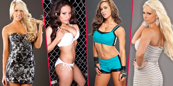
Every week, following WWE.com and ImpactWrestling.com’s photoshoot updates, we’ll take a look at the newest Diva and Knockout shoots and give you the opportunity to voice your opinions on them in a feature we lovingly call Unwrapped. Let’s unwrap this week’s eye candy, featuring AJ, Kelly Kelly, Maryse, and Rosita:
Note about TNA photoshoots: Many of the new photoshoots on ImpactWrestling.com only consist of 3 or fewer photos, which hardly lends enough material for an Unwrapped post. In order to make it worth your (and my) while, I’ll only cover ones with 3 or more photos to them. Please don’t leave comments asking about a missing photoshoot.
AJ
 A Diva’s ring gear can often serve as an extension of her personality, and AJ’s gear does that better than most. The bright blue color is eye-catching and sporty, the skull and crossbones adorning her hip and knees serve as personal iconography, and the modified Chuck Taylors are quite unlike any other Diva’s boots. The whole look sets her apart and shows that she’s worked at crafting a unique look and personality for herself, and I really admire that. The color of her gear works really well with the background color, making the photos really pop. Her poses are pretty simple, but little touches, like jutting out a hip or positioning her arms a certain way make them interesting. She manages to look genuinely cute, which is not something that is easily done in the WWE, when Divas are more apt to look like supermodels rather than the girl next door.
Rating: • • • • •
• View the photoshoot.
Kelly Kelly
 A black and silver dress and some super long hair are all that were needed for Kelly create an interesting look. The fact that there’s nothing else to compete with them for your attention makes the mermaid hair work–it’s sexy, especially when draped over one shoulder. A more busy look may have made the hair length look excessive. Here, it’s like another piece of the outfit (and no, that’s not a weave joke). Her poses use the hair like an accessory (again, not a weave joke), changing its position in nearly every shot, and she positions her body in ways that showcase it. I don’t blame her for making full use of that hair: it makes her look effortlessly sexy, and the photos are proof of that.
Rating: • • • • •
• View the photoshoot.
Maryse
 Looking like she jumped out of a magazine ad for some luxe perfume or diamond jewelry, Maryse is shining from pretty much everything she’s wearing. The plentiful jewels on her fingers, wrists and ears are far from subtle, yet they don’t look excessive. I think it’s probably due to the relative simplicity of the dress. Sure, it’s covered in ruching, but the champagne color (and the fact that it’s similar in color to the background) keeps the whole look toned down to allow the jewelry to shine. Her poses look like stuff out of those aforementioned ads, with her elegant hair and seductive, aloof poses. This is Maryse at her core: cold, sexy and beautiful. She’s so “above it all” and untouchable here that she won’t even bother to tell you to “talk to the hand”. It’s not groundbreaking stuff, but it’s certainly classic Maryse.
Rating: • • • • •
• View the photoshoot.
Rosita
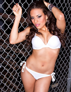 Almost every Knockout has done this kind of shoot, so I guess it was inevitable that Rosita would do the whole “pose in front of a chain link fence” thing too. The stark white bikini looks fantastic on her, no doubt, and her poses are sexy, but I can’t help but think how dirty the surroundings are, and how easily she could muck up that bikini by leaning too close to anything. This is a very obvious “sexy” set-up and while I don’t try to look for nuance in photoshoots (kind of like asking for a layered plot in a rom-com), these kind never really interest me. There’s just no subtlty about a girl in a bikini straddling a fence or bending over and showing her cleavage. I’ll give Rosita credit: she’s definitely hot here, but I really wish TNA would think outside the box when coming up with setting for their shoots. When the choice is between a stark white background, a locker room or a gritty corner of the arena, you know there’s never going to be much diversity in your photoshoots.
Rating: • • • • •
• View the photoshoot.
Which photoshoot did you like best? Vote in the poll below and speak your mind in the comments!
