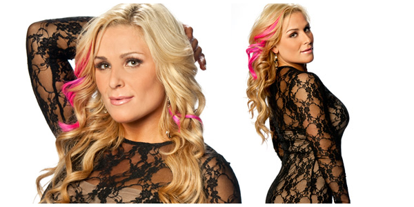
Our Unwrapped feature is making its return! Every week, coinciding with WWE.com’s weekly photoshoot updates, we’ll take a look at the newest Diva photoshoot and give you the opportunity to voice your opinions on it. Let’s unwrap this week’s eye candy, featuring Natalya. View the photoshoot by clicking here.
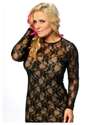
The Look: Natalya seems to have a knack for flattering her body while keeping it classy, and this outfit is no different–it hugs her curves and shows a lot of leg, but the high neckline and long sleeves balance out the skin exposure. The dress, which is pretty much a layer of black lace on top of a nude tube dress, looks amazing on her. The see-through elements show just enough, and while a not-quite-skin-tone second layer could look tacky or out of place, it works here, probably because it’s clear she’s not trying  to fool us into thinking that that layer is her skin. In fact, it looks like a taupe color, which neither clashes with the color of her skin or the style of the lace on top. The fact that she keeps everything else simple, makeup and accessory-wise, helps a great deal. That is, of course, not counting her pink highlights, which absolutely pop and compliment the look in an unexpected way. I’m sure a few would tut-tut at the bottom layer peeking out of the bottom of the dress, looking like an exposed slip, but it doesn’t really bother me too much.
The Poses: Usually in Natalya’s photoshoots we get a mix sexy, sweet, and quirky. Here, she’s tossed out most of the quirkiness, and I think that’s probably for the best. This outfit creates a mood better suited for serious poses, and Natalya pulls off a few good ones, giving a smoldering glance over her shoulder and rustling her hair with her hand. I also like the pose with both hands on either side of her head–it’s cute, and provides a small dash of that Natalya quirk. Aside from that, it’s rather typical, and the fact that it’s a studio shoot with a white background doesn’t add much more interest. Maybe a background in a different neutral color would have made the more conventional poses pop a little better.
Originality: A studio shoot with a white background is about as plain as you can get with WWE.com photoshoots, so there’s not much originality in the setting. Natalya, though, gives the shoot life with her eye-catching dress and charm, which are unique in themselves.
Overall: While Natalya has had more interesting photoshoots in terms of setting and poses, the dress is a jaw-dropper. She looks truly fantastic. Rating: 3.5/5
What did you think of the photoshoot? Give us your rating in the poll below and share your thoughts in the comments.
